7 beautiful hair salon web designs
Your hair salon deserves a website that lets your services shine. So get inspired—we've curated some of our favorite hair salon website designs with examples and insights into what makes them great.
Operations Manager, Growth Services
First impressions matter, and these days, your hair salon's website is often the gateway to client exposure. You need a website that communicates what your brand is about and lets your credibility and the quality of your services shine.
We've rounded up our favorite hair salon websites that are doing it right, with easy to use navigation, clean design, professional photography, consistent color palettes and expert use of video.
The Lane

The Lane in San Francisco pairs a classic black and white aesthetic with contrasting warm reds and leafy greens to portray sophistication and relaxation. Their homepage is a wonderful example of clean design that makes it easy for users to navigate to the information they need. The highly visible red "Book Now" button grabs attention, allowing website visitors to book an appointment quickly and easily.
"Red call-to-action buttons outperform green button by over 20%" (CXL, 2020).
In addition, to their clean design and savvy use of color, the use of professional photography and a stylized font (used in moderation), adds character without adding clutter that detracts from the purpose of the page.
Yello
Yello's neon color palette and energetic vibe permeates across the entirety of their brand—from interior design to the products they sell. Yello obviously understands who they are and how to represent their unique personality across their physical and virtual spaces. This website provides an excellent example of how consistent use of color and photographic style helps hold everything together.
"Color catches the eye first, which is why 39% of consumers believe that color is important to a brand’s website" (Top Design Firms, 2021).
In addition, Yello's use of fun animated gifs really brings their website to life while setting themselves apart from the crowd.
Palm Sunday
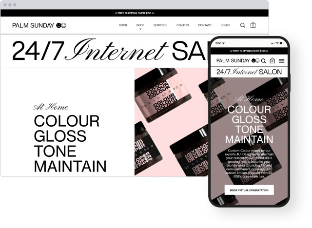
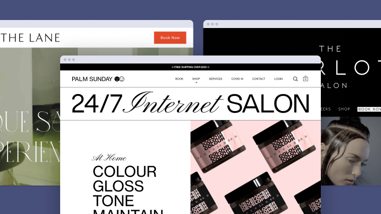
Palm Sunday knows the internet. This "Internet Salon" based in Toronto, Canada, is famous for their "At-Home Custom Color Kits" that can be purchased online to bring the salon experience to your home.
67% of mobile shoppers say they’re more likely to make a purchase if a website is mobile-friendly (WebFX, 2021)
A growing number of website traffic is from mobile devices. Keeping up with technology, Palm Sunday's site is super mobile-friendly and dually optimized for both large and small screens so clients can book and shop from any device.
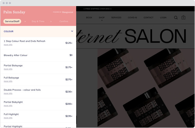
Palm Sunday's online booking platform matches their brand and is embedded directly on their website to keep clients on their page while creating a seamless booking experience.
Artika
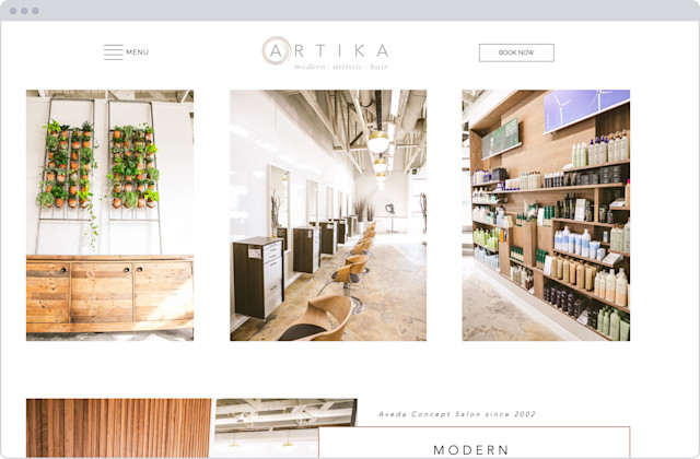
Artika's website design gives you a taste of the modern yet warm atmosphere of their hair spa. This website is a prime example of how a consistent photography style allows the page to flow. Extra white space on the page gives each section on the page room to breathe and makes it easier to digest information. Along with the previous examples, a prominent and clear 'Book Now' button makes it easy for clients to book.
"59% of people prefer browsing ‘beautiful and well-designed’ sites over basic ones" (Adobe, 2021).
Salon Mystique
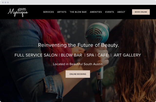
Salon Mystique is so much more than a salon. Their location in South Austin includes a full service salon, blow bar, spa, café, and art gallery. With so much to offer, their website is able to demonstrate the breadth of their business with a video background.
When you switch to a video background, there is a 138% improvement in conversion rate (techjury, 2022).
Salon Mystique uses video to make their salon's website more engaging and offer more information in a smaller amount of real estate. Seeing the salon in action gives their website visitors a look into the experience they will receive as a Salon Mystique client.
The Harlot

The Harlot is a renowned hair salon in Los Angeles. Their homepage features a bold video compiled from photoshoots, fashion shows, and team events that portray their distinctive and avant-garde attitude.
The average user spends 88% more time on pages with videos. (WebFX)
Similar to Salon Mystique, movement and video done right is more engaging and emotional than still-images or a wall of text. Harlot's homepage video shows off their multi-dimensional style, vast portfolio and talented team of stylists, telling a compelling story about the salon.
The Wordsmith

The Wordsmith's website embodies their mission to offer an exceptional beauty experience that extends beyond the exterior. This website puts their professionally designed logo front and center, overlayed on video content that showcases their team in action. You can easily browse their service menu, book an appointment, and shop their hair and skin products.
"90% of shoppers believe image quality is the most important factor when making online purchases" (Etsy, 2017).
Wordsmith's online shop is clean and simple with high-quality product images. According to Etsy buyer's survey, quality of images is even more important than cost, shipping cost, and reviews. Knowing that, investing in photography is definitely worth the effort.
Try Mangomint for free
See Mangomint in action instantly with pre-populated sample data. No credit card required. Free for 21 days.
Try it nowBeautiful Online Booking with Mangomint
All of the inspiring hair salons discussed above know the importance of providing a great experience for their clients online. That's why they chose Mangomint for their salon software and integrated online booking. Keep your site beautiful with booking that embeds directly on your website, allows brand customization, and is extremely easy for your clients to use.
Mangomint's next-generation salon & spa software is designed to reduce costs and increase profits using smart automations and a beautiful client experience from booking to checkout.
To learn more about the software, please book a live demo or start a free trial today.
